
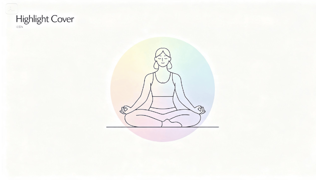
Highlight covers are one of those tiny design details that most visitors won't consciously notice, right up until they're missing or mismatched, at which point an entire profile can suddenly feel unfinished. A row of default gray circles or inconsistent screenshots quietly undermines an otherwise polished feed.
With text to image generation, designing a full set of custom, cohesive covers no longer requires hours in a design program. Dreamina is especially useful here, producing clean, simplified icon-style graphics that hold together as a genuine set rather than a scattered collection.
Here's how to design a set that actually elevates your profile.
Why highlight covers deserve more thought than a quick icon grab
Highlight covers sit permanently at the top of a profile, visible before anyone even scrolls into a single post. That prime, unavoidable placement means a mismatched or low-effort set quietly signals inconsistency, while a genuinely cohesive one reinforces professionalism before a visitor reads a single caption.
Grouping your content before you design a single cover
Before opening Dreamina, list out the actual categories your highlights need to cover — services, testimonials, behind-the-scenes, FAQs. This planning step prevents redundant categories later and ensures every cover you design has a clear, distinct purpose.
-
Group similar content types together rather than creating too many categories
-
Prioritize the categories new visitors are most likely to check first
-
Leave room to add a category or two as your content grows
Choosing one visual system for every category
A cohesive set relies on one consistent visual system applied across every icon — same line weight, same color palette, same general style — rather than a unique treatment for each individual cover. This consistency is what makes a set read as intentional rather than assembled piecemeal.
Design a full highlight set in three moves
Dreamina makes producing a complete, matching set fast enough to finish in one sitting.
Step 1: Write a detailed prompt
Go to Dreamina and describe your highlight icon concept in detail, including subject, art style, and color palette. If you already have brand colors established, upload a reference image to keep the palette accurate.
Example: A minimalist highlight cover icon illustration of a person dressed as a travel blogger holding a camera, soft pastel color palette, simple line-art style, circular icon composition.
Step 2: Adjust parameters and generate
Select Image 5.0 Pro, powered by Seedream 5.0 Pro, for clean, consistent linework across every icon in your set, then set your aspect ratio to a square format, choose your canvas size, and pick 1K or 2K resolution depending on your platform's requirements. Click the generate icon to render each cover.
Step 3: Customize and download
Refine each design using Dreamina's tools: inpaint to adjust specific icon details, expand to reframe the composition before cropping, remove to simplify any busy elements, and retouch for a final crisp finish. Once each one is ready, click Download.
Dreamina: a creative tool with multiple image generation models
Dreamina offers several image generation models, and for a project built around consistency across many small graphics, Seedream 5.0 Pro is particularly well suited. Its precise editing lets you swap just the central icon or subject in each cover, like changing a camera for a paintbrush, while keeping the surrounding style, color, and composition identical across the entire set. This matters far more here than in a single standalone image, since even a slight inconsistency between covers becomes obvious once they're lined up together at the top of a profile.
Nano Banana offers quick generation for testing icon ideas across several categories before finalizing a full set, while GPT Image 2 handles prompts describing specific stylistic requirements closely, useful when your brand has particular visual rules you want followed precisely.
Keeping icons simple enough to read at a glance
Highlight covers are viewed extremely small, so simplicity matters more than detail here than almost anywhere else in your visual content. A single clear subject with minimal background elements reads far more clearly than a busy, detailed illustration ever could at this size.
Matching covers to your overall feed aesthetic
Your highlight covers should feel like a natural extension of your broader feed style, not a separate design decision made in isolation. Pulling color and style cues directly from your existing content keeps the whole profile feeling like one unified visual experience.
Updating your set without starting over each time
As your content categories evolve, you'll occasionally need a new cover or two added to an existing set. Keeping your original prompts and reference images on hand makes it easy to generate a perfectly matching addition later, rather than redesigning the entire set from scratch.
Where polished highlight covers make a real difference
A well-designed set pays off in a few specific, high-visibility places:
-
Instagram and similar platform profile pages
-
Link-in-bio pages referencing the same visual categories
-
Business pitch decks showcasing social media presence
-
Brand style guides documenting visual consistency
Ordering your highlights for maximum first impression
The order your highlights appear in matters almost as much as their design. Placing your most important or most frequently checked category first — often something like services or an introduction — ensures new visitors see it before they've decided whether to keep scrolling.
Coordinating covers with your bio and pinned posts
Your highlight covers shouldn't feel like a separate design decision from the rest of your profile. Pulling the same color palette and tone into your bio graphics and pinned posts creates a single, unified first impression the moment someone lands on your page, rather than several disconnected visual choices competing for attention.
Small details, big first impression
A visitor's very first scroll across your profile often happens before they've read anything at all, and your highlight covers are part of that instant judgment.
With Dreamina and the consistency-focused precision of AI algorithms, building a genuinely polished set takes far less effort than it looks like it should, and it's free to start designing today.